
Pixel Art & Pixel fonts
Just as bitmap graphic fonts can be divided into bitmap fonts or raster fonts, vector graphic fonts can be divided into outline fonts or vector fonts.
Bitmap Fonts
Characters or glyphs in a bitmap font are made up of pixels. Every
character is represented by a bitmap, or a collection of pixels, hence
the name bitmap font.
Bitmap fonts are used in embedded systems where computation power is
low; the information of a character is very small, and the individual
pixels can be drawn very quickly.
As with scaling pixel art illustrations, scaling a bitmap font results in loss of quality. Bitmap fonts look their best when the size equals the purpose-made size.
If a system needs a different size of a particular bitmap font, then the bitmap font with the new size has to be made separately for the best results.
Outline Fonts
Characters in an outline font are described by Bézier curves;
mathematical descriptions of lines and curves. The great benefit of
outline fonts compared with bitmap fonts is scaling without loss of
quality.
An outline font can be scaled to any preferred size, and the quality
will remain the same.
The standard for the description of the outline font is Adobe PostScript. Postscript is also used in Adobe Illustrator.
If a character is displayed, the Bézier curves are used to transform the
specific character to the required horizontal and vertical pixels. This
requires a lot of processing power, and is done by a so-called RIP: a
raster image processor. Bézier curves are sent to the raster image
processor and the pixelated image is generated.
During the conversion of the Bézier curves to individual pixels, more or
less quality is lost depending on the algorithms used by the raster
image processor.
A commonly used technique to increase the quality of the outline font is
anti-aliasing.
Anti-aliasing is used to prevent 'jagged edges'; trapped, most of the
time asymmetrical, hard edges around the outline of the font.
By using an anti-aliasing technique called supersampling, the edges will
look more softened/blurred. This works fine if the font size is not too
small. If the font size is small, the font may look too blurred/fuzzy
and becomes difficult to read, if anti-aliasing is used.
By using supersampling a single pixel is divided into subpixels. In this
example a grid is used, but other types of division can be used as well.
The intensity of all subpixels combined is used to calculate the
intensity of the individual pixel.
The amount of subdivision can be adjusted; more subpixels, means more
calculations.
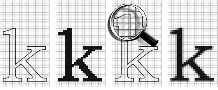
In the next example the outline font on the left is shown without anti-aliasing; the outline font on the right is shown with anti-aliasing.
Pixel Fonts
The name pixel font is a bit misleading. The name suggests that pixel fonts are bitmap fonts, but this is not always true.
A pixel font is a font that looks crisp/aliased on the screen; a pixel is either black (or any other color) or white (or any other color); not shaded in between - maximum contrast.
A bitmap font is by definition a pixel font, but an outline font can be
a pixel font as well.
The borders of an outline font can be equal to the edges of the pixels
on the screen. Anti-aliasing these fonts produces no visual effect; the
individual pixels of a character are either black or white, not shaded
in between, which makes the characters look crisp.